One of the most important hurdles for an indie author / self-publisher to overcome is making sure your product can be displayed side-by-side with what the buying public is used to seeing from traditional publishers.
This task is much easier for fiction than for nonfiction, but no matter what the subject, it costs just as much money to design and format a book that looks like it was made by “loving hands at home,” as Dan Poynter used to say, as it does to create a polished, professional looking book.
To a great extent the layout and design of your digital / e-book is out of your control:
- Digital books are “reflowable.”
- Readers can choose from pre-installed fonts and adjust font size, and the book will simply reflow to accommodate the changes.
- Drop caps are going to be a challenge.
- You won’t be able to easily avoid indenting the first line of text (traditionally, the first line of text in a section would not be indented the same way subsequent paragraphs would).
- You won’t have headers or footers in your e-book.
But your print book can have all of these things. There’s a catch, though: your print book has to be carefully engineered to be “handler friendly.” Have you ever tried reading a book where the text ran into the binding too closely? It puts a lot of stress on your thumbs and hands trying to keep a book open wider than intended. Likewise, you don’t want the text too close to the outer edges so readers are forced to constantly move their hands around.
So, what elements should you pay attention to when formatting a book for print? Well, first, grab a handful of text books and books printed by traditional publishing houses such as Random House, Simon and Schuster and McGraw Hill, and study them. First of all, these book will all be laid out in proper design software, and not word processing software. So, most likely Adobe InDesign. Never Microsoft Word. InDesign gives you complete control to the smallest measurement of spacing between letters, between lines, extended glyphs (letters, numbers, and other characters) and so much more.
Here’s what you’ll see in most traditionally published books:
- A cohesive look between cover and interior. The same fonts, and even the same elements will be used throughout.
- Serif fonts (the fonts with the little “feet” on them).
- This font will not be Times. Times is a narrow newspaper font, meant for narrow newspaper columns; Garamond, Caslon, Bembo, Century Schoolbook and Georgia are options to consider.
- Deep margins so people can comfortably hold the book.
- Page numbers that are odd on the right, even on the left.
- If not centred, the page number will be on the outer edge of the page.
- Chapters starting on the right hand page (this is not always the case these days as publishers try to save costs by printing fewer pages).
- First lines of new chapters without indents. But, sometimes they are (there are different styles). Sometimes there’s a drop cap. Sometimes the first line is in all caps or small caps.
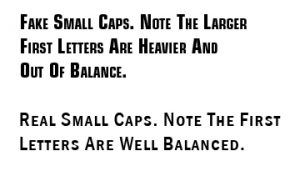
- Real small caps (use the actual small caps font, otherwise the strokes on the capital letters look too thick).
- Leading (the space between lines) in proportion to the line width, and is easy to read. Making it too deep or too narrow will hamper reading.
- Lines that don’t exceed 70 characters. People have to blink and if the line’s too long, they’ll lose their spot.
- Proper use of hyphens, em dashes and en dashes.
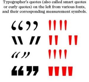
- Proper (slanted) quotation marks, and not the symbols for feet and inches.
- Blank pages without numbers or headers.
- New chapters that start part way down the page. Sometimes creative spacing is employed, with chapter numbers and title near the top, with the text beginning two-thirds of the way down. Most books start one-third of the way down with the chapter title.
- The word “chapter” is not always there (oh my!).
- No “title caps” for chapter heads (where every word is capitalized). Standard upper and lower case norms are followed, or if the titles aren’t too long, then all caps.
- Text justified on both sides (except bulleted lists, which are usually too short to do this properly).


