This is a carefully curated list of Google Fonts that work well for typesetting both print and digital books. After this list, you’ll find more on what makes certain fonts better than others, what to look for when choosing fonts, and a list of those used by major publishers like Random House.
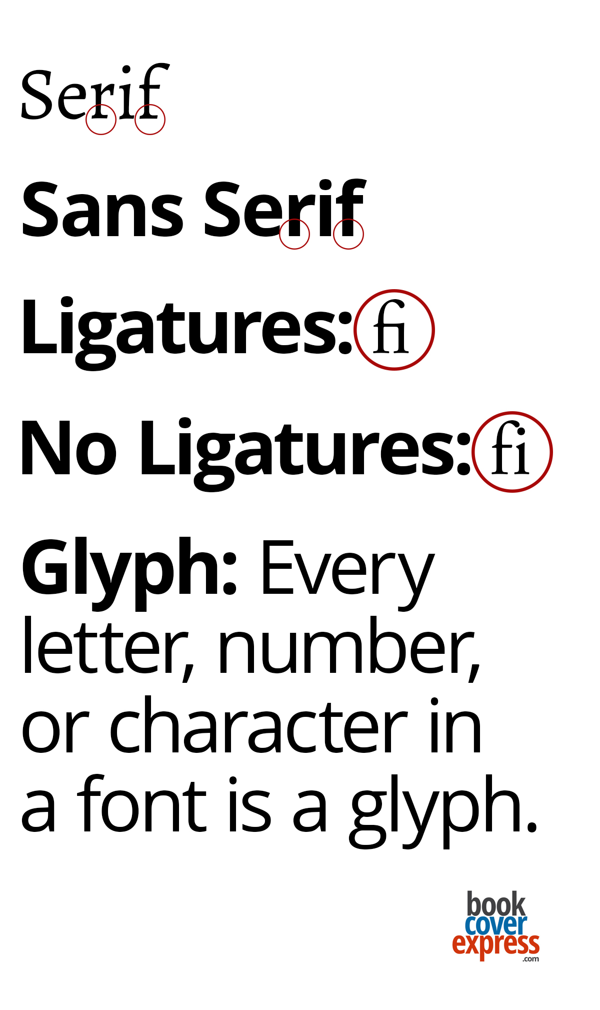
The traditional choice for typesetting books has always been a serif font. (insert picture). However, John T. T. Richardson’s paper The Legibility of Serif and Sans-serif Typefaces: Reading from Paper and Reading from Screens (2022) found “there’s no difference in the legibility of serif and sans-serif typefaces either when reading from paper or when reading from screens. This contradicts various assertions made over the last 100 years by typographers, designers, and other authority figures.” Do with that what you will.
Many Google Fonts have been created by well-known designers and type foundries. They’re offered with a generous Open Font license, or similar terms, so that you can use them for your book, your website, or other projects. They’re accessible to anyone who wants to download them. You can access the license by clicking “License” above the font name. The simple permissions are always listed on the right.
Font terms you should know:
- Typeface: A family of fonts that often includes Roman, italic, bold, and various weights and alternate styles. For example, Arial is the typeface, while Arial Italic and Arial Bold are two fonts within that typeface.
- Serif font: A font with small “feet” or decorative strokes at the bottom and tips of the letters. Times is a serif font.
- Sans-serif font: A font with no serifs. Arial is a sans-serif font.
- Glyph: Any letter, number, or character in a font.
- Ligature: Two letters combined into a single unit for decorative purposes or to save space, often seen with “fi.”
Free serif fonts for books
- Literata: Created as the brand typeface for Google Play Books. According to Google Fonts, Literata “won the GOLD Indigo Awards in 2021 and is the Modern Cyrillic 2021 winner. Two versions of the family exist, one for print and the other for e-books.”
- Merriweather: I use Merriweather to typeset a newspaper I work for, and it has never failed me. There’s also a sans-serif version if you want a complementary font for chapter headings and footnotes.
- Cormorant Garamond: An elegant, almost elaborate font with decorative glyphs, stylized ligatures (insert picture), and a stylized ampersand in the italics.
- EB Garamond: Slightly heavier than Cormorant Garamond, with a similar selection of stylized glyphs and an elegant italic ampersand.
- Alegreya: One of my favourites. There’s also a sans-serif version for headings. Its heavy, angular italics should be tested to ensure they reflect the genre and voice of your project.
- Besley: A slab serif based on the well-known Clarendon typeface.
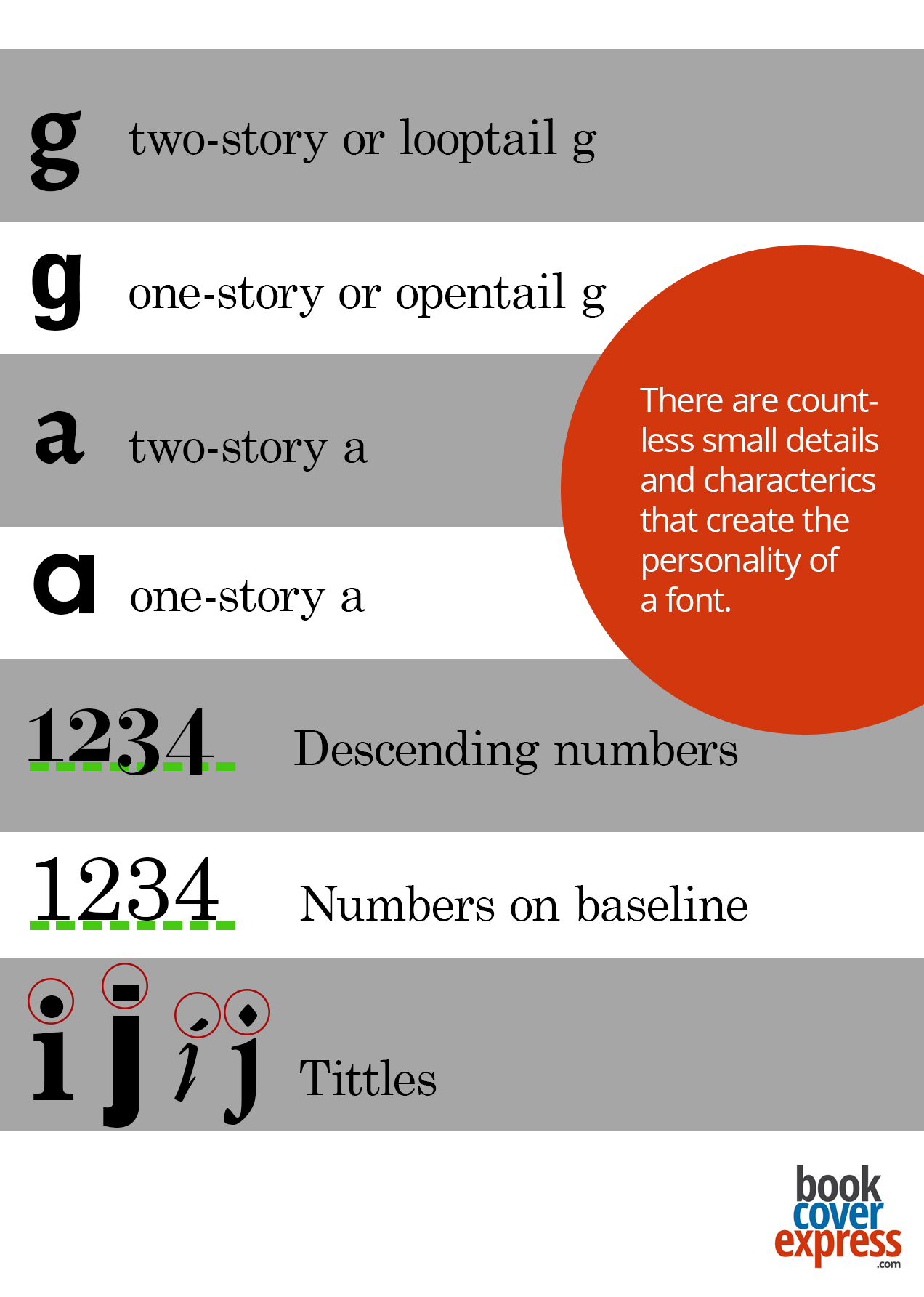
- Fraunces: An elegant font. Note the “g”: the Roman versions have a two-storey “g” with a loop tail, while the italics use a one-storey “g.”
Free sans-serif fonts for books
- Source Sans 3: Adobe’s first open-source typeface family, designed by Paul D. Hunt and intended to work well in user interfaces.
- Open Sans: My most-used font. I work in multiple languages, and it has never let me down. Open Sans was designed by Steve Matteson, former Type Director for Monotype and Ascender Corp.
- Jost: Created by Owen Earl, founder of Indestructible Type.
- Roboto: The Long Way Home by Masha Maroz (2024) was set in Roboto. It has become the official font of government and other official branding.
Accessible book fonts (sans-serif)
- Lexend: Designed to reduce visual stress and improve reading performance. Created for readers with dyslexia and other reading challenges, but an excellent option for anyone.
- Atkinson Hyperlegible: Designed to improve comprehension for readers with low vision. It won Fast Company’s Innovation by Design Award in 2019 and, in 2024, was added to the Cooper Hewitt, Smithsonian Design Museum’s permanent collection.
Fonts used by traditional publishers
From the 1980s to the present, the most popular textbook font has been Garamond. It remains one of the most widely used fonts in book production. The Harry Potter series was set in Adobe Garamond. One of the reasons for Garamond’s popularity was the belief that it required less ink to print, although no studies support this.
Mrs. Eaves and Bembo are also popular book fonts. Learning to Die (2024) by Robert Bringhurst and Jan Zwicky is typeset in Bembo Roman, with Fairbank used for italics.
Most popular fonts for print books
These require a purchased licence, but most are available through Adobe Fonts or come packaged with software. Terms vary.
- Adobe Garamond
- Bembo
- Sentinel
- Adobe Jenson
- Baskerville
- Minion Pro
- Caslon
- Georgia
- Mrs. Eaves
- Palatino
- Sabon
- Bookmania
- Corundum (lovely italics)
What to look for when choosing a font
- Ensure you have the licence to use the font in all the ways you intend. Many foundries charge additional fees for use in e-books or on websites.
- The wider and heavier the font, the more space and ink it requires, increasing printing costs.
- Make sure the font includes all the characters you’ll need. If your text includes accented letters, confirm that those glyphs are available.
- You’ll need at least four styles: Roman, italic, bold, and bold italic. “Faux styles” in software may not embed correctly in your PDF.
- The font must suit the book’s genre, support the author’s credibility, and be easy to read. No one should have to work to read your text.
- Test several fonts on a sample chapter before committing. Ensure the heading and body fonts work well together.
Pay attention to the little things
- If using more than one font, check whether the tittles (dots above the lowercase “i” and “j”) match. Some are round, some square, some oval or diamond-shaped. I try to match them if possible.
- Decide whether you prefer a one-storey or two-storey “g.”
- Check whether the capital “I” resembles the numeral one, and if that works for you.
- Examine the italic version, which is often more decorative than the Roman.
- Consider whether you want ligatures.
Fonts and credibility
The following is an excerpt from a previous article I published a few years ago:
There is evidence suggesting that people judge a document’s credibility based on its font. It’s true: Comic Sans really can keep you out of graduate school. In 2012, The New York Times compared Computer Modern, Baskerville, Georgia, Helvetica, Comic Sans, and Trebuchet. Online readers, unaware of the research, were asked to read an article presented in a randomly assigned font. Forty thousand people responded.
The article discussed a study on optimism versus pessimism and was presented in two parts. After reading it, participants rated how believable the study’s conclusion was. Those who read the article set in Baskerville were most likely to believe the conclusion, followed closely by those who read it in Georgia.
A bit less formal, but equally interesting, was a comparison by Canadian university student Phil Renaud in 2006. Renaud discovered that fonts seemed to affect his grades. He wrote 52 essays over several semesters using Times New Roman, Trebuchet MS, and Georgia. When tallied, the 23 essays set in Georgia averaged an A, while the 18 in Trebuchet MS averaged a B-minus. The remaining essays in Times New Roman averaged an A-minus. His conclusion was less about stroke height and more general: “I want to say that serifs appeal to academics more than sans serifs do.” Perhaps they do. The winners in The New York Times experiment were both serif fonts, and the subject matter of the article was academic.

Related Articles
For authors planning to self-publish, paying attention to traditionally published titles can be one of the smartest forms of market research. Publishers invest [...]
Authors spend a lot of time building audiences on social media. They post on Facebook, Instagram, LinkedIn, TikTok, and whatever new platform appears [...]
One of the advantages of self-publishing is that authors have the freedom to test ideas and gather feedback before their books go to print. [...]